Role
Product Designer
Scope
Design System + UX + UI
Timeline
9 Months
Asset Classes
Stocks · MF · ETF · Bonds
platform
iOS & Android
status
In Production
01 — Context & Problem
For experienced investors, every detail matters. Portfolio value is only one part of the story—they're also tracking asset allocation, risk exposure, and market movements across multiple instruments. The design system was built to make complex financial information easy to navigate without sacrificing depth.
02 — philosophy
We didn't start with a manifesto. These principles emerged from repeated decisions, trade-offs, and discussions. Writing them down transformed implicit instincts into a shared decision-making framework.
01
DENSITY
High information, not
high noise
For experienced investors, information density is a feature, not a flaw. The interface was designed to accommodate large amounts of data while using hierarchy, spacing, and typography to maintain clarity.
02
PRECISION
Numbers that can be trusted
Small inaccuracies can undermine confidence in an entire platform. The design emphasises precision by making data freshness visible and ensuring numerical information remains consistent across the experience.
03
CONFIGURABILITY
Their view, not ours
We designed for expertise, not assumptions. The experience respects users' knowledge by providing direct access to the information and controls they need without unnecessary simplification.
04
VOCABULARY
No dumbing down
We chose not to translate industry concepts into simplified alternatives. Using established financial terminology reduced ambiguity and aligned the product with the expectations of its audience.
05
REGISTER
Serious, not flashy
Every color choice had a functional purpose. Red and green were dedicated to performance indicators, while the rest of the interface relied on hierarchy, typography, and spacing to create emphasis.
06
RESILIENCE
Errors aren't edge cases
At this scale, edge cases aren't edge cases. Transaction failures were designed with the same care and clarity as successful outcomes.
03 — process
We didn't begin with screens—we began with foundations. Tokens defined the rules, components applied them, and patterns brought them together. Atomic Design provided a scalable framework for managing complexity as the system expanded.

04 — The impact
A design system isn't tested by the screens it launches with, but by the ones added later. The combination of reusable components, tokenized foundations, and theme support ensured the product could evolve without accumulating design debt.
Components shipped
Design Velocity
Dark/light parity
Both modes fully specified — no
component is dark-only or light-only
Asset classes covered
Stocks, MF, ETFs, Bonds — each with
tailored component variants
Hardcoded hex values
Every color reference in every
component points to a token.
Component variants
making complex workflows easier to scale and maintain.
05 — Foundations · Color System
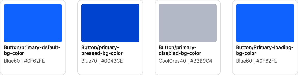
The palette was designed for interpretation, not decoration. By assigning clear semantic roles to each color family, the system ensures critical financial signals remain unambiguous across screens, states, and themes.

light mode — Primary
dark mode — Primary

backgrounds

accents

semantics Light mode

semantics dark mode

Data Visualization

By introducing a semantic token layer, components remain independent of specific color values. This abstraction enables light and dark themes to share the same component architecture while adapting visually through token changes alone.

06 — Foundations · Typography
Inter across the board — chosen for its legibility at small sizes, its tabular numerics, and the fact that it doesn't draw attention to itself. Every size, weight, and line height in the system maps to a named token. Nothing is hardcoded.
TYPEFACE
WEIGHTS IN USE
Semibold — 600
Medium — 500
Regular — 400

07 — Component Library
Atoms came first — buttons, inputs, chips, the building blocks. Then the layer no generic library covers: watchlists, order cards, chart modules built specifically for how HNI users read financial data.
09 — reflections
Users experience the product; teams rely on the system behind it. The design system provides the foundation that keeps every screen, interaction, and state consistent as the product grows.